FDA-leonielamb
Friday, 11 March 2016
Monuments Should Not Be Trusted... Research & work based practice
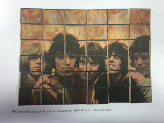
Today we went to look at the exhibition at Monuments Should not be Trusted, at the Nottingham Contemporary. The exhibition is based around communism and the divide in Yugoslavia around 1950's - 1980's. The exhibition had a wide range of pieces including sculptures, film, collage, photography, painting, music videos, and gifts made by workers for the president. The different ways in which some of the works were presented was really cool and interesting, there was one piece which was presented on match boxes. This is a great idea in which interacts with the viewer which in turn will make them look into your image more. Provoking questions and narratives behind your piece, its a idea to think about using in my own works.
Thursday, 11 February 2016
My Final Images
For my final 6 images I chose to do the image manipulation on creating the optical illusion portraits. For this I used my own family 2 children myself and partner. I took images of us all with front and side view shots and this is where the work began. On preparing for the shoot I had to remember to try and get the same size head shots for each side and front view image this will make it easier for me to put them together. I watched some online tutorials to help me with the process in photoshop.
These are the final 6 I chose for the end results. I will be printing and framing them also adding the oval mount to them too.
This video helped me to create the images.
After taking my images I opened them up in photoshop and chose which two pictures to put together by doing this I would change drag the side view image on top of the forward facing image and change the opacity on the side view. This helped me determine if the faces would align up for a smoother finishing looking image.
After I was happy with the line up I changed the opacity back up to full and used the magic wand to select the background. Once that was done I then inverted the image and pressed delete this gave me the outline of the side profile so you could see the layer underneath. I then used the move tool to postion where I wanted the side profile outline to sit on my bottom layer. I used quite a lot of tools to get my images to how I wanted them these included the pen tool, eraser, paint bucket, brush these was to get my images looking polished and tidy. On some of the images I had to scale some image up and down to get the right fit. I wanted a completely white background so chose to paint bucket the areas out. While doing these they reminded me of Victorian ages and came up with an idea to have a mount over my image in the shape of an oval this would give an older feel to images.
Below are some images I took ready for production. This was done with a 2 light set up my main light with a white umbrella attached and the second light with a soft box attached. The lights was either side of us quite close in.
f/8, 1/80sec, iso 100
The images reminded me of stamps, so I had a thought of maybe mounting them on card and adding a trim round the edges to symbolize the stamp. I also tried out different styles of the oval rim in photoshop with different colours to see the effects and weather I wanted to print or just have them as online files.
Subscribe to:
Comments (Atom)


